Depth, spread and liquidity
Chapter 4 followed individual orders through their lives. This chapter zooms out: stop asking whose order is standing and ask how much is standing, at every price, at every moment. That aggregate — the total at each price, not the individual orders — is called depth, and it is what traders mean by liquidity: how much you could trade right now without moving the price.
Two frames carry it, both computed by the pipeline you already run:
depth— one row per (moment, price level): the level's standing volume after each event that touched it;depth_summary— one row per moment: best bid/ask, and liquidity binned by distance from the mid.
Depth on the toy: a ledger you can audit
price_level_volume turns the event stream into the depth frame. On
the toy session it is seventeen rows — short enough to read whole:
%matplotlib inline
from ob_analytics import toy_events, toy_trades
from ob_analytics.analytics import set_order_types
from ob_analytics.depth import price_level_volume

events = set_order_types(toy_events(), toy_trades())
depth = price_level_volume(events)
depth
| event_id | timestamp | price | volume | direction | |
|---|---|---|---|---|---|
| 0 | 1 | 2026-01-05 10:00:00+00:00 | 99 | 2 | bid |
| 1 | 2 | 2026-01-05 10:00:02+00:00 | 101 | 3 | ask |
| 2 | 3 | 2026-01-05 10:00:05+00:00 | 98 | 1 | bid |
| 3 | 4 | 2026-01-05 10:00:06+00:00 | 99 | 4 | bid |
| 4 | 5 | 2026-01-05 10:00:08+00:00 | 98 | 4 | bid |
| 5 | 6 | 2026-01-05 10:00:12+00:00 | 102 | 2 | ask |
| 7 | 8 | 2026-01-05 10:00:20+00:00 | 101 | 2 | ask |
| 9 | 10 | 2026-01-05 10:00:35+00:00 | 103 | 2 | ask |
| 10 | 11 | 2026-01-05 10:00:40+00:00 | 98 | 1 | bid |
| 11 | 12 | 2026-01-05 10:00:45+00:00 | 100 | 1 | bid |
| 12 | 13 | 2026-01-05 10:00:45.800000+00:00 | 100 | 0 | bid |
| 13 | 14 | 2026-01-05 10:00:48+00:00 | 101 | 3 | bid |
| 14 | 15 | 2026-01-05 10:00:48+00:00 | 101 | 0 | ask |
| 15 | 16 | 2026-01-05 10:00:48+00:00 | 101 | 1 | bid |
| 17 | 18 | 2026-01-05 10:00:52+00:00 | 101 | 0 | bid |
| 20 | 21 | 2026-01-05 10:00:56+00:00 | 99 | 2 | bid |
| 22 | 23 | 2026-01-05 10:00:57+00:00 | 99 | 1 | bid |
Each row says: at this moment, this price level's standing total became this. Follow one level — 98 — down the column: 1 when Chen arrives (t=5), 4 when Dana stacks her 3 on top (t=8), back to 1 when Dana cancels (t=40). Level 100 is Eve's whole flash: 1 at t=45.0, 0 at t=45.8. Chapter 1's keyframes, rewritten as a ledger.
The depth heatmap, checked against the ledger
Chapter 1 described a depth heatmap as "the keyframe strip compressed into pixels." Now we can show that directly: the heatmap on top, and below it the book it compresses, sampled every ten seconds. Time runs right, each price level is a horizontal band, and colour is the standing volume from the ledger above.
import matplotlib.pyplot as plt
from _docs_theme import plot_book_keyframes, plot_toy_depth_heatmap

from ob_analytics.depth import depth_metrics, get_spread

summary = depth_metrics(depth)
spread = get_spread(summary)

fig = plt.figure(figsize=(15, 7))
gs = fig.add_gridspec(2, 7, height_ratios=[2.2, 0.9], hspace=0.3, wspace=0.14)
ax_hm = fig.add_subplot(gs[0, :])
plot_toy_depth_heatmap(depth, spread, toy_trades(), ax=ax_hm)
ax_hm.set_title("")  # replace the face's centered title with our own
ax_hm.set_title("The toy minute, compressed", fontsize=10, loc="left")
key_axes = [fig.add_subplot(gs[1, i]) for i in range(7)]
for axk in key_axes[1:]:
    axk.sharey(key_axes[0])
plot_book_keyframes(events, toy_trades(), every_s=10, ax_row=key_axes)
for axk in key_axes[1:]:
    axk.tick_params(labelleft=False)
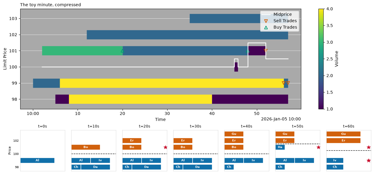
Audit it band by band against the ledger:
- 99 starts blue (Alice's 2), turns yellow at t=6 (Ivy joins: 4), and pales again only when Sam's sweep prints (the two ▽ markers).
- 98 runs purple → yellow → purple: Chen alone, Chen+Dana, Chen alone again after the t=40 cancellation — liquidity vanishing with no trade anywhere.
- 100 holds a single purple fleck at t=45: Eve's 800 ms, one pixel wide, with the white mid line stepping around it.
- 101 follows Bob: green (3) until Frank's △ fill (2, blue), consumed entirely when Hana crosses at t=48 — then briefly appearing as a bid (her resting remainder) before Iris's ▽ removes it.
- 102 and 103 appear when Erin and Gus arrive and never change: the outer levels, unchanged.
The white line is the mid price; the markers are the five trades. Everything chapter 1 taught in thirteen hand-drawn frames is here in one image — that is the compression a heatmap gives you, and on real data it is the only way to see half an hour at once.
The summary: best quotes and binned liquidity
depth_metrics reduces the same information the other way — one row
per moment, answering "what are the best quotes, and how much stands
near them?" Watch it react to Eve. Here are the rows bracketing her
flash:
cols = ["timestamp", "best_bid_price", "best_bid_vol", "best_ask_price"]
summary.loc[summary["timestamp"].dt.second.isin([45, 46]), cols]
| timestamp | best_bid_price | best_bid_vol | best_ask_price | |
|---|---|---|---|---|
| 9 | 2026-01-05 10:00:45+00:00 | 100 | 1 | 101 |
| 10 | 2026-01-05 10:00:45.800000+00:00 | 99 | 4 | 101 |
At 10:00:45.000 the best bid jumps to 100 × 1 — Eve is the best bid
for 800 ms — and at 45.800 it falls back to 99 × 4. get_spread
extracts exactly these transitions (it is where every mid-price line
in this tutorial comes from).
The remaining forty-odd columns bin liquidity by distance from the mid in basis points — recall a basis point is 1/100th of a percent. With the mid at 100, level 99 sits 100 bps below; the toy's arithmetic is mental again:
row = summary.loc[
    summary["timestamp"].dt.second == 30,
    ["timestamp", "bid_vol100bps", "bid_vol200bps", "ask_vol100bps", "ask_vol200bps"],
]
row
| timestamp | bid_vol100bps | bid_vol200bps | ask_vol100bps | ask_vol200bps |
|---|
At t=30: within 100 bps of the mid stand 4 bid units (Alice + Ivy at
99) and 2 ask units (Bob at 101); widen to 200 bps and the bins add
Chen + Dana's 4 at 98 and Erin's 2 at 102. Cumulative rings around the
mid — "how much could I trade within X bps of fair value?" — computed
at every moment. The ring width and count are configuration
(PipelineConfig.depth_bps, depth_bins), which is how the same code
serves BTC at \$78,000 and a \$4 penny stock.
The colour scale is a modelling choice
Before touching real data, one constructed example — because the heatmap's default colour scale has a failure mode you should meet on data you control. Build a book with two 500-lot whale walls a percent either side of the mid, and a working region at the touch whose levels hold between 1 and 5 units — thin, but structured: sizes step up and down over the minute, the way real near-touch liquidity changes:
import pandas as pd

t0 = events["timestamp"].iloc[0]
rows = []
for i, s in enumerate(range(0, 61, 5)):
    t = t0 + pd.Timedelta(seconds=s)
    rows += [
        {"timestamp": t, "price": 99.0, "volume": 500.0, "direction": "bid"},
        {"timestamp": t, "price": 101.0, "volume": 500.0, "direction": "ask"},
        # near-touch levels, sizes 1-5, drifting over time:
        {"timestamp": t, "price": 99.9, "volume": 1.0 + i % 5, "direction": "bid"},
        {
            "timestamp": t,
            "price": 99.8,
            "volume": 1.0 + (i + 2) % 5,
            "direction": "bid",
        },
        {
            "timestamp": t,
            "price": 100.1,
            "volume": 1.0 + (i + 1) % 5,
            "direction": "ask",
        },
        {
            "timestamp": t,
            "price": 100.2,
            "volume": 1.0 + (i + 3) % 5,
            "direction": "ask",
        },
    ]
wall = pd.DataFrame(rows)
wall["direction"] = pd.Categorical(wall["direction"], categories=["bid", "ask"])
import matplotlib.pyplot as plt

fig, (ax1, ax2) = plt.subplots(1, 2, figsize=(13, 4.6), sharey=True)
for ax, bias, title in (
    (ax1, 1.0, "col_bias=1.0 (default, linear)"),
    (ax2, 0.1, "col_bias=0.1 (thin levels brightened)"),
):
    plot_toy_depth_heatmap(wall, col_bias=bias, ax=ax, band_pt=14, volume_scale=1)
    if (legend := ax.get_legend()) is not None:
        legend.remove()  # no mid/trades in the constructed book
    # regular ticks across the whole range: gray rows are real prices
    # with nothing resting at them, not missing data
    ax.set_yticks([99.0 + 0.2 * k for k in range(11)])
    ax.set_title(title, fontsize=10)
fig.tight_layout()
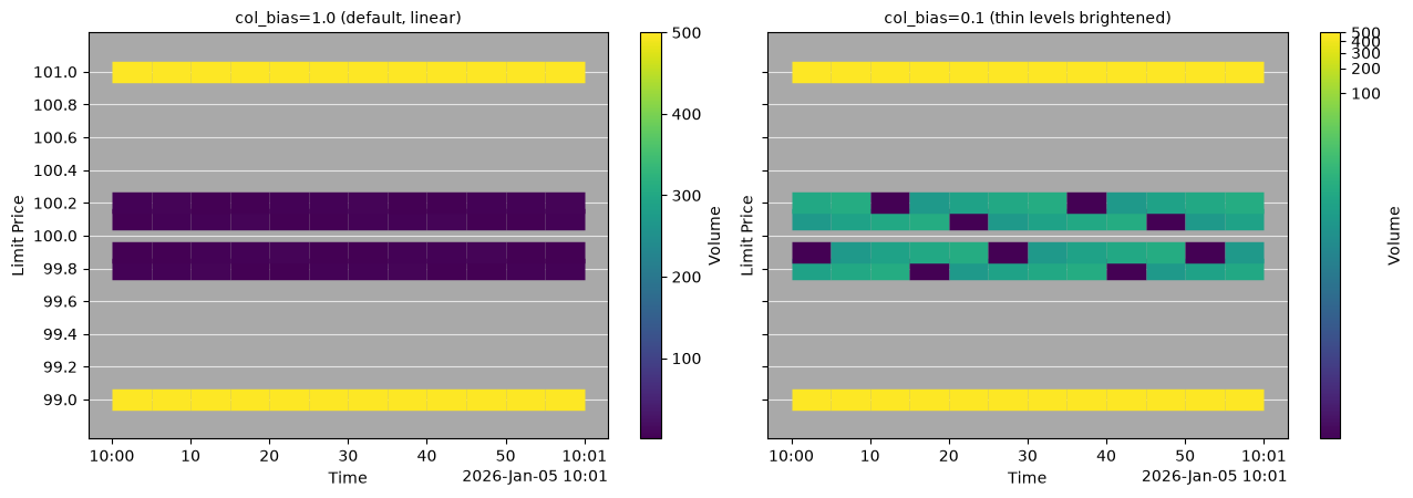
Same book twice — the y-axis now ticks every 0.2 so you can see the
gray for what it is: price levels where nothing rests (an order book
is sparse; most prices are empty most of the time). On the left, the
linear scale spends its whole
colour range separating 500 from 496 — the near-touch levels, whose
sizes range over a full factor of five, are compressed into
indistinguishable darkness. Those near-touch levels are exactly the
liquidity your next order would meet, and they are the part you cannot
read. On the right,
col_bias=0.1 applies a power-law bend: the 1-vs-5 structure at the
touch becomes visible colour steps, while the walls stay unmistakably
the brightest thing on the plot.
Neither picture is "correct" — they answer different questions:
| You are asking… | Use |
|---|---|
| Where are the big walls? Does the book have structure? | col_bias=1.0 (default) |
| What will my order actually trade against near the touch? | col_bias ≈ 0.1–0.4 |
| Volumes span many orders of magnitude and both matter | col_bias<=0 (log scale) |
Pitfall: the default hides what you trade against
Real crypto books are heavy-tailed — a few giant resting walls and thousands of small orders near the touch. On the linear default the walls glow and the touch region fades to black, which reads as "no liquidity near the mid" precisely where all your executions will happen. If you are studying fills, microstructure, or anything within a few bps of the mid, bend the scale.
Real depth
The bundled capture — zoomed to its busiest ten minutes and to the
price levels active there, so the structure the prose points at is
actually visible (a full-session render averages it away). One
render, with the scale bent to col_bias=0.4 — the middle row of
the table above, walls and touch both readable:
from _docs_theme import plot_sample_heatmap

from ob_analytics import Pipeline, sample_csv_path
from ob_analytics.visualization import display_result

result = Pipeline().run(sample_csv_path())
# Canonical prices are integer ticks (issue #155); show quote currency.
result = display_result(result)
fig = plot_sample_heatmap(result, col_bias=0.4)
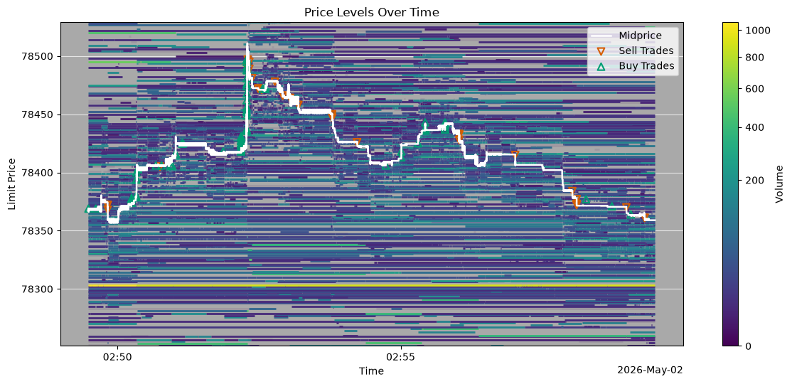
Everything from this chapter is in one figure. The bright horizontal bands are persistent resting walls — the same walls as the constructed example, on real data; when one disappears it disappears all at once, a single cancellation removing the entire level (the same move as Dana's, at a thousand times the size). Around the moving white mid, the bent scale keeps the thin, fast-changing liquidity readable — the region where the trade markers print. Same behaviour as the toy: arrivals thicken a band, cancellations thin it, trades consume the touch.
Next: Trades and flow toxicity — from the book's standing liquidity to the aggression in the trade tape, and the metrics that measure it.
Vocabulary introduced here — depth, spread, mid-price, basis point — lives in the Glossary.