The visualization system
Every figure in this tutorial — the ladders, the keyframe strips, the heatmaps, the queue trajectories, the toxicity faces — came from one small system with three moving parts. This closing chapter names them, so that when you want a figure this tutorial did not draw, you know which of the three to change.
The three parts are:
- concept — what to show (
depth_heatmap,trade_tape,queue_position, …); - level — at what resolution,
L2(aggregated) orL3(per-order), the distinction from chapter 2; - backend — with which renderer: Matplotlib (static, default), Plotly (interactive), or Bokeh (interactive, suited to Bokeh / Panel server dashboards and streaming views).
Name a concept and a level; the system finds the data preparation and the renderer for you.
The one-liner
You have used it since chapter 1. A PipelineResult knows how to plot
itself:
%matplotlib inline
from ob_analytics import Pipeline, sample_csv_path
from ob_analytics.visualization import display_result

result = Pipeline().run(sample_csv_path())
# Canonical prices are integer ticks (issue #155); show quote currency.
result = display_result(result)
fig = result.plot("depth_heatmap")  # level defaults sensibly per concept
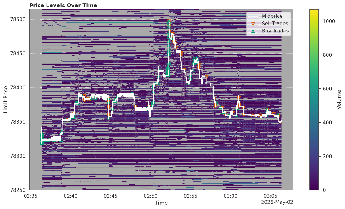
result.plot(concept, level) (and the equivalent free function
plot_result(result, concept, level)) is the whole convenience layer.
It does not guess what a result can draw — it knows, because that
depends on the data's resolution, exactly as chapter 2 promised. Ask
it:
{'trade_tape': ['L2', 'L3'],
 'depth_heatmap': ['L2'],
 'order_activity': ['L2', 'L3'],
 'cancellations': ['L2', 'L3'],
 'book_snapshot': ['L2', 'L3'],
 'depth_chart': ['L2', 'L3'],
 'book_replay': ['L2', 'L3'],
 'order_outcome': ['L3'],
 'queue_position': ['L3'],
 'liquidity_at_touch': ['L2', 'L3'],
 'volume_percentiles': ['L2'],
 'price_view': ['L2'],
 'events_histogram': ['L2'],
 'trade_size': ['L2'],
 'kyle_lambda': [],
 'l1_ticker': [],
 'ofi_horizon': [],
 'order_flow_imbalance': [],
 'vpin': []}
Each concept maps to the levels this particular result can render.
A Bitstamp capture carries per-order identity, so most concepts offer
both L2 and L3; some are inherently one resolution —
depth_heatmap aggregates by construction (L2 only), while
queue_position and order_outcome need per-order identity (L3
only). Run this on a feed that lost identity and the L3 rows would
simply not appear: the menu is a function of the data, not a fixed
list.
The concept catalogue
Here is the whole vocabulary at a glance — every concept rendered from this one capture, grouped by the question it answers and tagged with the chapter that introduced it:
import matplotlib.pyplot as plt
import pandas as pd
from _docs_theme import DOCS_THEME

from ob_analytics.depth import get_spread
from ob_analytics.visualization import plot, prepare

t0 = result.trades["timestamp"].min()
t1 = t0 + pd.Timedelta(minutes=10)
spread = get_spread(result.depth_summary)

catalogue = [
    (
        "depth_heatmap",
        "L2",
        lambda: prepare.price_levels(
            result.depth,
            spread=spread,
            trades=result.trades,
            col_bias=0.4,
            start_time=t0,
            end_time=t1,
        ),
    ),
    (
        "trade_tape",
        "L2",
        lambda: prepare.trades(
            result.trades, spread=spread, start_time=t0, end_time=t1
        ),
    ),
    ("order_outcome", "L3", lambda: prepare.order_outcome_l3(result.events)),
    (
        "queue_position",
        "L3",
        lambda: prepare.queue_position_l3(result.events, start_time=t0, end_time=t1),
    ),
    (
        "volume_percentiles",
        "L2",
        lambda: prepare.volume_percentiles(
            result.depth_summary, start_time=t0, end_time=t1
        ),
    ),
    ("cancellations", "L3", lambda: prepare.cancellations_l3(result.events)),
]

fig, axes = plt.subplots(2, 3, figsize=(16, 8))
for ax, (concept, level, make_payload) in zip(axes.ravel(), catalogue):
    plot(concept, level=level, ax=ax, theme=DOCS_THEME, **make_payload())
    ax.set_title(f"{concept}  ·  {level}", fontsize=10)
fig.tight_layout()
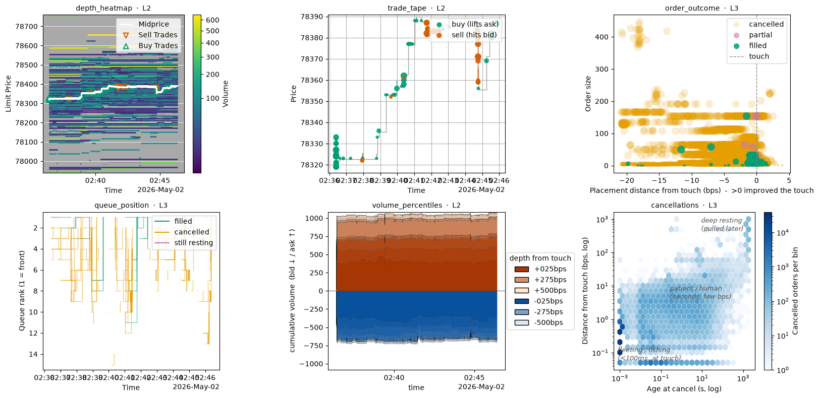
Six of the concepts, one capture, one loop. The full set, organised:
| Question | Concepts | Introduced |
|---|---|---|
| What does the book look like? | book_snapshot, depth_chart, depth_heatmap |
1, 5 |
| What traded? | trade_tape, trade_size, events_histogram |
1 |
| How much liquidity, and where? | volume_percentiles, liquidity_at_touch, price_view |
5 |
| Who placed, waited, cancelled, filled? | order_activity, order_outcome, queue_position, cancellations |
2, 4 |
| What do measurements of the run show? | l1_ticker, vpin, kyle_lambda, order_flow_imbalance, ofi_horizon |
1, 6 |
The last row is the metrics. A metric is computed from the
finished run, not read straight off it, and it has no resolution:
available_concepts lists each one with an empty level list. They
draw with the same one-liner as the rest:
l1_ticker draws the best bid, best ask and last trade over time. Give
it an instant, result.plot("l1_ticker", at=...), and it draws the
quote card from chapter 1 for that instant instead.
Under the one-liner: plot and prepare
The one-liner is a shortcut for two explicit steps you have watched every composite figure in this tutorial take. Prepare the data for a concept, then plot it:
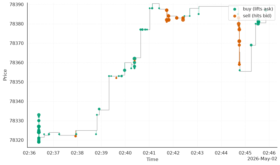
payload = prepare.trades(result.trades, spread=spread, start_time=t0, end_time=t1)
fig = plot("trade_tape", level="L2", **payload)
prepare.<concept>(...) turns analysis frames into the exact payload a
face needs and hands it back as a dict; plot(concept, level, **payload)
renders it. result.plot("trade_tape", "L2") is precisely these two
lines with the arguments filled in for you.
Reach past the one-liner for two things, both of which appeared earlier in this tutorial:
- Custom arguments to a face — the
col_bias,start_time,price_fromwindowing knobs from chapter 5 arepreparearguments. ax=to place a face in a multi-panel figure — every keyframe strip and story composite in this tutorial isplot(..., ax=...)into a grid.
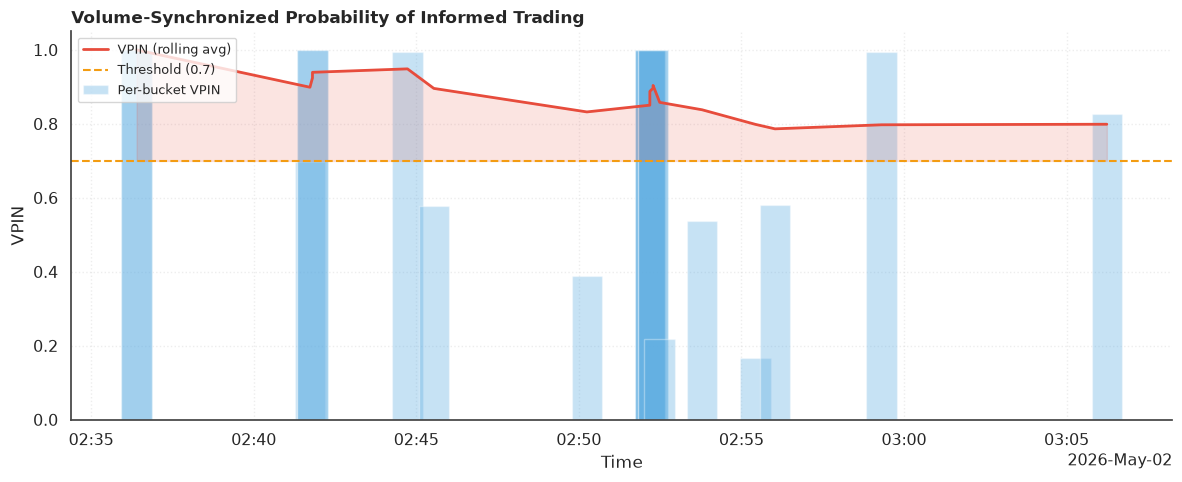
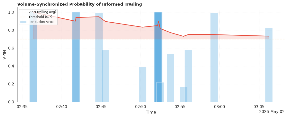
A metric's settings do not need either step. A keyword to the one-liner
goes to the calculation or to the picture, whichever names it. Here
bucket_volume sizes the VPIN buckets (twenty of them across this
capture, not the default one), n_buckets averages them ten at a time
(the default window of fifty would never fill), and threshold places
the alert line:
fig = result.plot(
    "vpin",
    bucket_volume=result.trades["volume"].sum() / 20,
    n_buckets=10,
    threshold=0.7,
)
The progression across this whole tutorial has been exactly this
ladder: result.plot(...) when you want a figure now, plot +
prepare when you want control, and — for data past the in-memory
envelope — the pre-slicing you met in chapter 3. Convenience, control,
scale — the same three levels seaborn and similar libraries offer.
Three backends
Everything so far rendered with Matplotlib. Pass backend="plotly"
for an interactive figure — zoom, pan, hover — from the same concept
and data (Plotly ships in the [interactive] extra):
fig = result.plot("depth_heatmap", backend="plotly", col_bias=0.4)
type(fig).__module__.split(".")[0], type(fig).__name__
('plotly', 'Figure')
The call returns a Plotly figure instead of a Matplotlib one; in a
notebook fig.show() renders it live, and fig.write_html("depth.html")
saves a standalone interactive file.
backend="bokeh" renders the same concept a third way (Bokeh ships in
the [bokeh] extra) — it covers the core concepts (trade_tape,
depth_heatmap, book_snapshot, depth_chart), and is the one to
reach for when the figure is going into a Bokeh or Panel server app
rather than a notebook or a static page:
fig = result.plot("depth_heatmap", backend="bokeh", col_bias=0.4)
type(fig).__module__.split(".")[0], type(fig).__name__
('bokeh', 'figure')
The rule of thumb:
| You want… | Backend |
|---|---|
| A figure for a paper, README, or the docs | matplotlib (default) |
| To explore — zoom into a burst, read exact values on hover | plotly |
| A figure embedded in a Bokeh / Panel server app or streaming view | bokeh |
| A fourth renderer | register your own (below) |
Backends live in a registry, so a new one is a module path away —
register_plot_backend("altair", "my_package._altair_backend") — the
same structural-typing story as loaders and formats from
chapter 3. See
Extending ob-analytics.
Theming
There is no global style to set and accidentally leak between figures.
A PlotTheme is passed per call and applies only to that call (it is
how every figure in this tutorial shares one look — the DOCS_THEME
used above):
from ob_analytics.visualization import PlotTheme, save_figure

theme = PlotTheme(style="whitegrid", context="talk", font_scale=1.1)
fig = plot(
    "trade_tape",
    level="L2",
    theme=theme,
    **prepare.trades(result.trades, spread=spread, start_time=t0, end_time=t1),
)
save_figure(fig, "trades_talk.png", dpi=200)
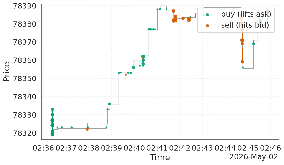
PlotTheme bundles a Seaborn style, context, font scale, and a
Palette of named colours; save_figure writes at the DPI you ask for.
The same theme works on every backend, so one concept looks the same in
each: the palette colours every backend's marks, the context and font
scale size its text, and the dark styles give Plotly and Bokeh
Seaborn's gray background. Each backend also takes its own overrides:
rc for Matplotlib, plotly_layout for Plotly, and bokeh_figure for
Bokeh.
from ob_analytics.visualization import Palette

theme = PlotTheme(
    context="talk",
    palette=Palette(buy="#1f77b4", sell="#d62728"),
    plotly_layout={"font": {"family": "Georgia"}},
)
plot("trade_tape", level="L2", theme=theme, **payload)
plot("trade_tape", level="L2", backend="plotly", theme=theme, **payload)
Wrapping up
You started with a single number on a screen and the claim that it was the top of an order book. Eight chapters later you can load one from any of three feeds, reconstruct it to the individual order, read its depth and its queue, score the toxicity of its flow, and render any of it two ways — all from frames small enough, at the toy scale, to check by hand.
Where to go next:
- How-to guides — task-focused recipes: your own data, LOBSTER, custom loaders, live capture, the CLI.
- Extending ob-analytics — add a data source, an export format, a plot backend, a live capturer.
- API reference — the visualization, analytics, and flow-toxicity modules, function by function.
- Glossary — every term this tutorial introduced, in one place.
Vocabulary introduced here — concept, level, backend, the
plot / prepare split — lives in the
Glossary.